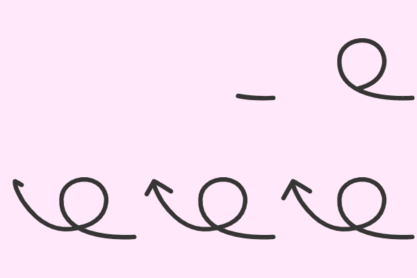


Here is the piece that makes the whole thing make sense: a path is simply the edge of a design. So text to path means exactly what it says, you are putting your text onto the edge of a shape. Once that lands, the rest stops feeling like a trick.
The order matters more than people expect. You type your text flat first, then draw your shape, and only then bring the two together. Melissa shows the small handle you have to grab to make the text snap onto the path, and why double clicking your text first is the step that gets skipped.
From there it moves into the parts that trip people up. There is a lever that slides your text inside or outside the shape, and getting your words to sit under a circle rather than over it takes a specific move that sometimes needs a couple of tries. When the letters end up bunched together or spread too far apart, that is a spacing fix rather than a positioning one, and Melissa shows where that setting lives.
The step almost everyone forgets
Getting the text curved is only half of it. If you delete your circle at that point, your text springs right back to flat. There is one more thing you have to do to lock the curve in place, and once you know what it is you will never lose a design to it again. Then the shape comes away and your curved text stays exactly where you put it. Watch the full free video this month, before it moves to the members-only library.